

Starting from checking mails, viewing notifications from social networks, online messaging to shopping –everything that was once only possible via desktop are done though mobile devices nowadays. As the adoption of mobile devices, such as smartphones and tabs, is reaching a new high every time there’s a survey on the same, the need of mobile-friendly websites is also gaining importance.
However, not many website owners are aware of this need and still relying on their old desktop- friendly version. On the other side, there are site owners wishing for mobile-friendly sites but don’t have much knowledge on it. Is there a way though which a site can equally gratify both desktop and mobile users? Yes, there is a form of website designing that is equally favored by both these type of users – Responsive Design.
What is Responsive Design?
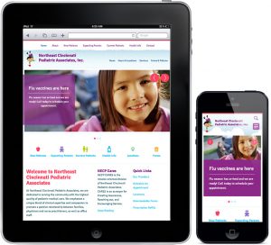
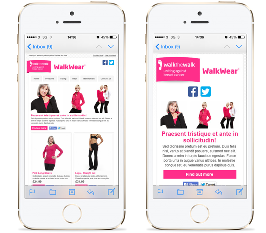
Responsive design is a website built in such a manner that it will modify the position of content, or re-size them, as per the width of the devices used to access it. When you view a particular website that supports responsive design on desktop, you will be able to see the entire site including some ads that keep popping on the left and right hand sides. When the same website is viewed on a smartphone, the site adapts itself to your device, eliminates these ads, displaying a compact version of it. This is how a responsive site looks on different devices:
Now, as you know what is a responsive design, let’s answer another question that people often come up with while redesigning their website.
Is there any difference between mobile templates and responsive design?
Yes. Responsive design and mobile templates are two forms through which you can build a mobile website. Responsive design requires only one website to be coded in such a manner that it adapts to the screen sizes of other devices used for viewing it.
Conversely, mobile template requires you to build a separate website or a sub-domain that can be properly viewed on a mobile device. Additionally, mobile templates are created to fit one specific screen size.
Why Responsive Design?
Responsive design is so far the most popular and extensively used designing methods adopted for mobile websites. And here are some more reasons for you to have a responsive website.
Mobile Usage is on the Rise
The topic might sound like a cliché to some of you, but surprisingly many website owners of bigger companies still don’t have a responsive site. Just take a tour of your workplace or step outside your house, you will see almost 70-75% people busy doing something on their smartphone.
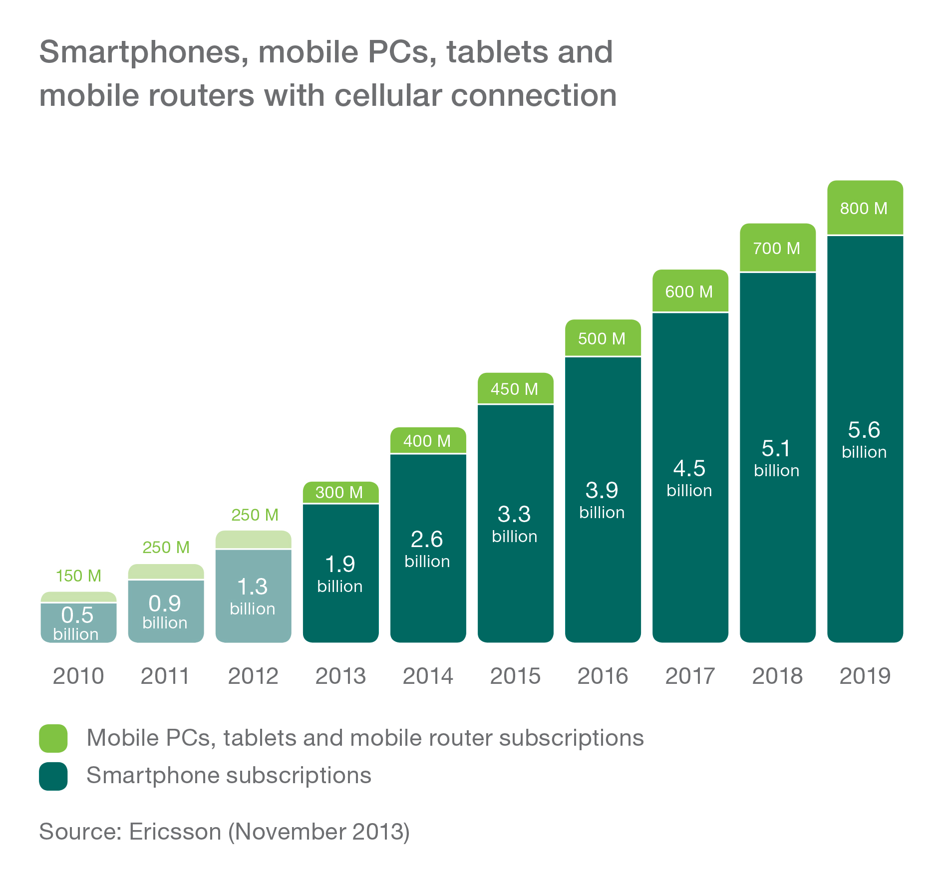
Ericsson’s latest Mobility Report states – the number of global smartphone subscriptions will grow from 1.9 billion in 2013 to 5.6 billion by 2019. Also a KPCB report on mobile internet trends states –30% Of All Mobile Users Are Now Smartphone Users.If you still need more clues on this, go through this study on mobile marketing statistics 2014.
Great User Experience
Responsive design provides users with much better user experience. You no longer have to zoom in and scroll for ages on your mobile screen to reach specific part of the content that you were looking for, as the content intuitively adapts to the device you are using. This helps navigate a site with ease.

Google’s Think Insights on Mobile survey says if users land on your website and fail to track the content they are looking for, there is 61% chance for them to leave the site and look for another one. Once users are impressed with your site, the chance for them to buy or use a product from your site is 67%.
Even Google Recommends Responsive Websites
Google claimed that it prefers responsive design as recommended mobile configuration as confirmed by Pierre Far, Google Webmaster Trends Analyst. But why?

Google finds it easier to crawl, index and organize responsive sites – just because every version of the site has the same URL and HTML. If a company has two separate sites for desktop and mobile users, each site will have different HTML and URL, which will affect its SEO ranking as it will compel Google to crawl both sites separately.
Easy to Manage
Two separate websites would mean two different SEO campaigns. Why would you take up such an expensive task if it can be easily done with a single site that is responsive? Just image how much time and resource you have to spend behind developers, content writers, marketing team, social media experts and PR executives to get this campaign run successfully.

A site with responsive design will keep your team and customers satisfied ensuring no wastage of time and effort, and will guarantee less confusion to users.
It’s the Future of Web Design
Going responsive is the future of web designing and everyone is following this trend. One of the best things about responsive design is it crafted to fit in every screen size not device used. This means no matter what device you are using to view the site, it will adapt to the screen size easily.

Mobile watches and glasses are the latest craze and will be widely used for web browsing as we can estimate, and if you don’t go responsive, you will miss out gaining more followers using such devices.
As the number of mobile device users has been jumping higher with the passing of each year, one thing has become very clear to the world: Going mobile is the new way of internet surfing. Moreover, it seems that going responsive is the best way to respond to rise in use of mobile devices and advancement of mobile technology. If you have any questions or opinion on this topic, share with us in the comments section.