
The Overview Statistics report provides Moodle administrators with a visual summary of important site-wide information. It combines charts and tabular data to help administrators quickly understand user activity, user demographics, language preferences, and course distribution.
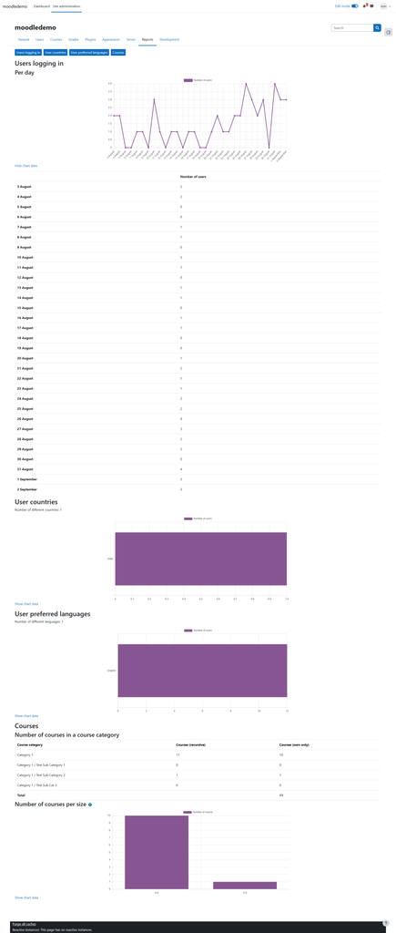
The report is divided into four main areas: Users logging in, User countries, User preferred languages, and Courses.
Users Logging In
The Users logging in section shows the number of users who logged in to the Moodle site on each day.
The line graph represents login activity over time:
Horizontal axis: Date
Vertical axis: Number of users
Purple line: Number of users who logged in on that date
For example, if the graph shows a value of 4 for a particular date, it means four users were recorded as logging in for that day.
This report helps administrators identify daily usage patterns, including periods of higher or lower activity.
Below the graph, Moodle provides the same information as a table:
Date Number of users
3 August 2
4 August 2
5 August 0
7 August 1
10 August 3
26 August 4
1 September 3
2 September 4
The Show chart data / Hide chart data option can be used to display or hide this underlying table.
Note: This graph represents login activity, not the total number of registered users on the Moodle site.
User Countries
The User countries report shows how Moodle users are distributed according to the country specified in their user profiles.
In your screenshot, the report shows:
Number of different countries: 1
and the chart contains:
India: 1
The horizontal bar represents the number of users associated with each country.
This report can help administrators understand the geographical distribution of their Moodle users.
It is important to understand that this information comes from the user’s Moodle profile. It does not determine a user’s location from their IP address.
User Preferred Languages
The User preferred languages report shows users grouped according to their selected Moodle language.
In your screenshot:
Number of different languages: 1
The chart shows English as the preferred language, with approximately 12 users.
The graph can be interpreted as:
Preferred language → Number of users
This information is useful for Moodle sites serving multilingual audiences. For example, if a significant number of users prefer Spanish, French, or another language, administrators may consider providing translated course content or enabling additional Moodle language packs.
Again, this is based on the language preference stored in each user’s Moodle profile.
Courses
The Courses section provides information about the distribution and size of courses on the Moodle site.
It contains two separate reports.
Number of Courses in a Course Category
This table shows how courses are distributed across Moodle’s course categories.
There are two important columns:
Courses (recursive) counts courses contained within the selected category and its subcategories.
Courses (own only) counts courses belonging directly to that particular category.
For example, your screenshot shows approximately:
Course category Courses (recursive) Courses (own only)
Category 1 11 10
Category 1 / Test Sub Category 1 0 0
Category 1 / Test Sub Category 2 1 1
Category 1 / Test Sub Cat 3 0 0
This explains why Category 1 can show 11 recursively while containing only 10 courses directly.
It has:
10 courses directly in Category 1 + 1 course inside a subcategory = 11 recursive courses.
This report is particularly useful on larger Moodle installations because administrators can see whether courses are concentrated in particular categories or spread across multiple subcategories.
Number of Courses per Size
The final graph groups Moodle courses according to their size.
Rather than displaying every individual course, the plugin places courses into size ranges.
Your screenshot shows ranges such as:
0–4
5–9
The vertical axis represents the number of courses belonging to each range.
For example, the screenshot indicates that most courses fall into the 0–4 size range, while only a small number fall into the 5–9 range.
This gives administrators a quick overview of how large or small the courses on their Moodle installation are.
How to interpret the complete report
Together, these statistics answer four different administrative questions:
Users logging in → How actively is the Moodle site being used?
User countries → Where are our registered users located according to their profiles?
User preferred languages → Which Moodle languages do our users prefer?
Courses → How are our courses organized and how large are they?
Therefore, Overview Statistics is primarily a site-level administrative reporting tool. It is designed to give administrators a quick visual overview of the Moodle site’s users and courses rather than provide detailed learner analytics such as grades, course completion, time spent learning, or individual student progress.


